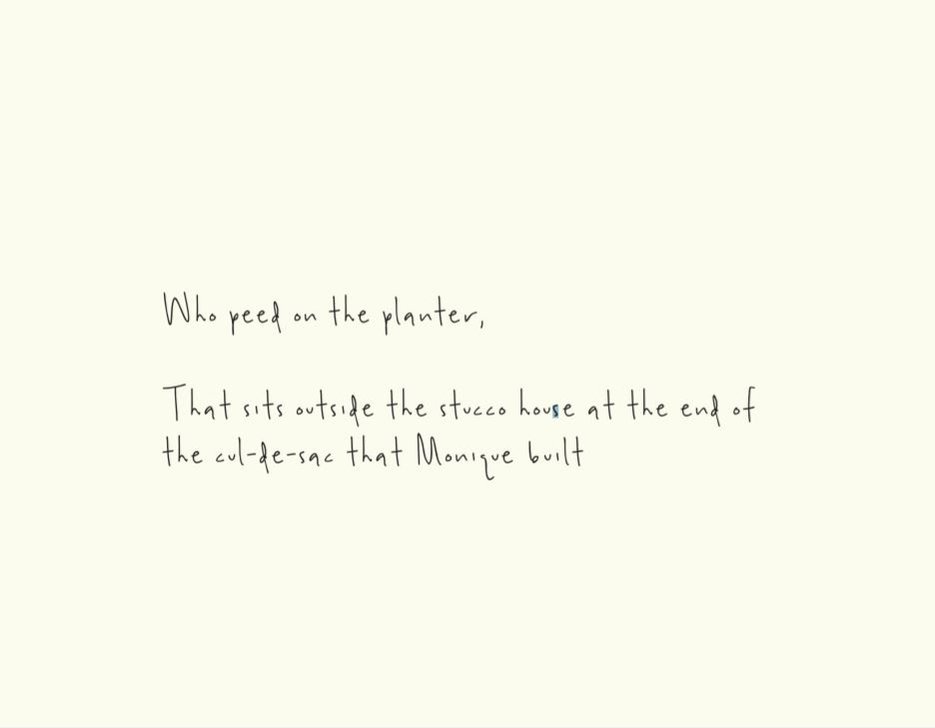
This is the Cul-de-Sac that Monique Built
October 13, 2020I wrote and illustrated a book using plasticine called This is the Cul-de-Sac that Monique Built. My book explores ideas of of socioeconomic status, built environments and a few characters who take up these spaces are introduced along the way. The book is definitely tongue in cheek and inspired by the children’s book This is the House that Jack Built. The starting point for me was taking serious ideas and displaying them in a playful manner, the overall goal was to create a children’s book for adults.
I wouldn’t say I was an odd child but I have fond memories coming home from nursery school, eating Alphagettis and watching the York Region real estate channel. I would go crazy when a pool came on the screen, particularly a smaller home that had an addition and housed an indoor swimming pool, I was deceived at a young age ;).
I often looked at real estate magazines and was enraptured by the images of new developments, in particular what looked like watercolour photos of the homes. I thought that if I visited these new developments they would look EXACTLY like the painted picture. I remember my dad and I took a drive to King City (a township of York Region) north of my home to look at houses. I was taken aback when I learned that homes in real life weren’t exact replications of the illustrations from the magazine, to be fair I was quite young, slow I was not.
The Cul-de-Sac that Monique Built brings together so many components that are constantly on my mind-housing, class, consumption. My inspiration came from estate communities that you’d find in York Region, it’s more northern part where land is vast. Exploring these communities is intriguing, some homes are beautiful ranch bungalows and others are colossal mini Versailles, wrapped in gold and equipped with wrought iron gates to enclose the (almost always) gaudy compound.
When envisioning my cul-de-sac I imagined a narrative including excess and socioeconomic status, I imagined the characters that come together in this community and each home, and what allows it to operate properly. I also gave some thought to the hierarchical positions the different personalities take up- which brought me to the idea of the homeowner scolding the delivery man. Lastly I wanted to bring in ideas of excess, which I find have been heightened since writing this book, I am inundated with these images on social media-interiors, clothing and food (I do love the platters of fried chicken sandwiches, you know)?
Some things changed over the course of writing the book, it took some time. I would often re-work illustrations that collected dust. I found the plasticine would seep for lack of a better word into the canvas so I’d like to thicken it up. Lastly, I do work full-time and art has definitely taken a back seat. It’s interesting when I reflect on it, I had difficulty finding an image of the the app for watering the garden, as smart home technology wasn’t as prevalent at the time of making this particular illustration. The delivery man is working for Canada Post, perhaps I would’ve modeled this character after an Amazon employee (more in tune with the times).
I also had to come to terms with the fact that I needed to hire someone to photograph the book and place the font appropriately. It’s one thing to make the images but another to have print-quality ones, as well making a book file that is print ready. I tried doing the latter on my own and failed! When Matt (my husband) gave me a deadline for the book, I found an incredible graphic designer who took the photos and assembled the book digitally. I reviewed a number of different fonts and chose the one in the images. It was really important I had something light-hearted but also legible. Lastly, Covid hit the world and I had to hold off on printing it.